- What you'll learn
- What “minimalist” really means in a calorie tracker, beyond a clean-looking interface
- Which apps reduce repeat logging work with saved meals, favorites, and recent foods
- How the ranking weighs calm UI, easy corrections, and low upsell pressure
- Why Kibora is a strong top-three pick for minimalist logging with useful insight
- When feature-rich apps like Cronometer or MyFitnessPal still make sense
- What to test in the first 10 minutes before you commit to an app
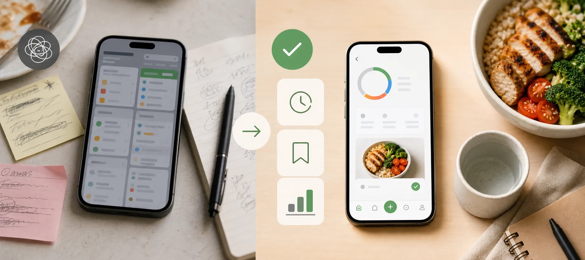
You know the pattern: a popup before breakfast, a crowded dashboard at lunch, a macro chart you did not ask for, then an upgrade prompt when you just want to log the same meal you eat every week. Calorie tracking is supposed to build awareness, but plenty of apps turn the daily act of logging into one more chore.
In this ranking, minimalist does not mean barebones. It means low-friction: faster repeat logging, easier corrections, calmer screens, useful saved foods, and quick progress checks without clutter or constant upsells.
The apps below are ranked by how much daily work they remove while still giving enough feedback to be useful. A minimalist calorie tracker is not the app that does the least; it is the app that asks the least from you each day while still giving back useful information.
What “minimalist” really means in a calorie tracker
Minimalist is not an aesthetic label. It is a workflow standard: fewer interruptions, fewer unnecessary decisions, and less effort to log the foods you actually eat most often.
That matters because calorie tracking is a form of self-monitoring, which can support weight-management efforts when people can stick with it. The National Institute of Diabetes and Digestive and Kidney Diseases puts self-monitoring alongside physical activity and dietary changes as part of effective weight-management strategies according to NIDDK, and broader research on adherence has explored the same connection in PubMed-indexed studies.
“The most effective weight-loss strategies are self-monitoring, physical activity, and dietary changes.”
So before ranking any app, here is the test: can you log a normal meal, fix a mistake, and understand your day without fighting the app? That is a better definition of minimalist than counting features.
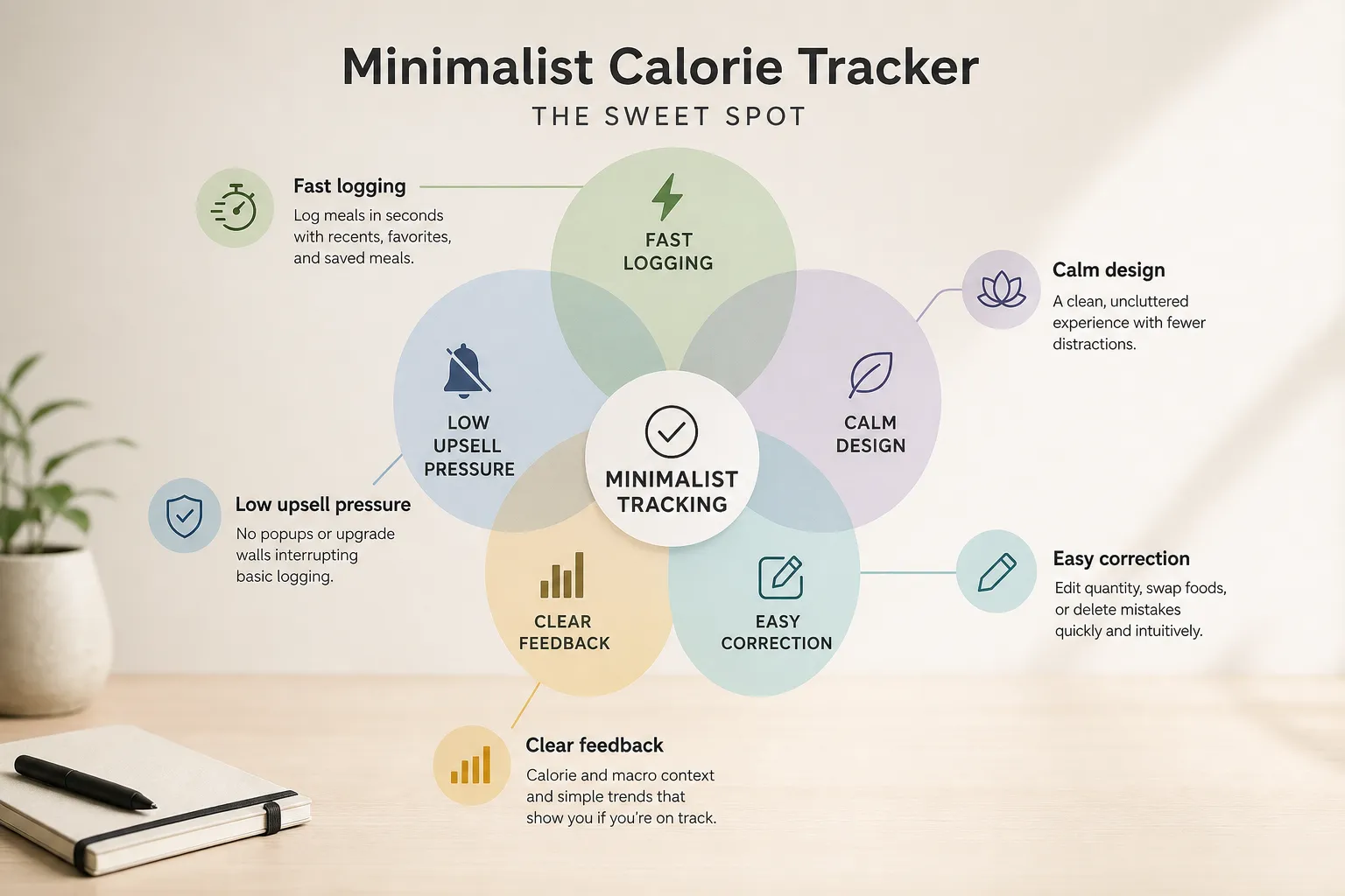
- Fast repeat logging: saved meals, recent foods, and favorites should make common meals quicker, not slower.
- Low clutter: the screen should stay calm, with limited ads, popups, and notification pressure.
- Easy correction: editing quantity, swapping foods, or deleting mistakes should be obvious.
- Clear feedback: calories, macro context, and simple trends should tell you whether you are on track.
- Limited upsell pressure: upgrade prompts should not interrupt basic logging.
This is why a visually clean app can still feel non-minimalist if it keeps pushing upgrades, while an app with more features can feel simpler if those features stay tucked away until needed. Barcode scanning, photo logging, macros, and trends are not anti-minimalist by default. They still belong in a simple calorie tracker app when they are optional and do not get in the way.
Saved meals are the clearest example. They add functionality, but they remove daily work, which is the point. If you want a deeper framework for turning logs into useful decisions, see this guide on making calorie tracking actually useful.
The best minimalist calorie tracker apps at a glance
If you want the short version, start with the apps that remove the most repeat logging work. For most people, the best minimalist tracker is the one that makes their most common meal take the fewest decisions to log.
This ranking is about workflow friction, not who has the fewest features on paper. Advanced tools are not automatically anti-minimalist if they stay optional, unobtrusive, and easy to ignore.
| Rank |
App |
Best for |
Why it feels minimalist |
Where it may feel less minimal |
Platforms |
Pricing / watch-out note |
| 1 |
FoodNoms |
Apple users who want a clean, fast food logging app |
Low-clutter interface, strong saved-food workflow, calm daily use |
Best experience is tied to the Apple ecosystem |
iPhone, iPad, Apple Watch, Mac |
Check current App Store details for subscription terms and regional differences |
| 2 |
Kibora |
People who want minimalist logging without losing the insight layer |
Designed to keep logging simple while still surfacing useful feedback |
Positioning depends on which insight features you actually want to use |
Check current availability |
Verify current plans and features before choosing |
| 3 |
Lose It! |
Mainstream users who want a simple calorie tracker app that feels approachable |
Friendly flow, familiar food database, easier to grasp than heavier dashboards |
Some users may still notice prompts, coaching layers, or feature nudges |
iPhone, Android |
Review current free vs paid limits in the app stores |
| 4 |
Cronometer |
Users who care about accuracy and deeper nutrient tracking |
Structured logging and clear nutrition data can reduce guesswork |
Nutrient depth can feel like extra mental load for strict minimalists |
iPhone, Android, Web |
Best if you will actually use the extra detail |
| 5 |
FatSecret |
Basic logging with a practical, no-frills feel |
Core food logging is straightforward and familiar |
Community features and older design patterns may feel less calm |
iPhone, Android, Web |
Good value pick if you are not bothered by legacy-style UX |
| 6 |
MyFitnessPal |
People who want a powerful, familiar nutrition tracker |
Huge database and established habits can make logging fast for existing users |
Dashboard density, premium prompts, and broader feature sprawl feel less minimalist |
iPhone, Android, Web |
Check current paywall behavior and barcode access by platform |
| 7 |
YAZIO |
Users who want more diet guidance and structure |
Guided plans can simplify decisions for some people |
That same guidance can feel too prescriptive or feature-heavy |
iPhone, Android |
Better fit for guided tracking than strict minimalism |
Here is the quick verdict on each app, using simple friction language instead of fake precision.
- FoodNoms: Best clean-first pick for Apple users. Logging friction: low. Upsell friction: low. Insight depth: medium.
- Kibora: Best for simple tracking with useful feedback still intact. Logging friction: low. Upsell friction: low to medium. Insight depth: medium.
- Lose It!: Best mainstream easy calorie tracking app for most people. Logging friction: low. Upsell friction: medium. Insight depth: medium.
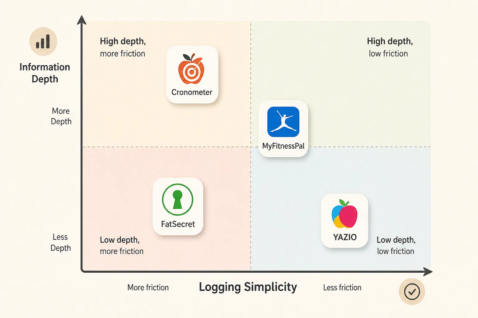
- Cronometer: Best for accurate nutrition detail, less ideal if you want a very light interface. Logging friction: medium. Upsell friction: low to medium. Insight depth: high.
- FatSecret: Best practical budget-friendly option if you can ignore extra community clutter. Logging friction: medium. Upsell friction: low. Insight depth: low to medium.
- MyFitnessPal: Best if familiarity matters more than calmness. Logging friction: medium. Upsell friction: medium to high. Insight depth: medium to high.
- YAZIO: Best for guided structure, not the purest fast logging app. Logging friction: medium. Upsell friction: medium. Insight depth: medium.
The order here is defensible, not absolute. App experience also changes by platform, recent updates, and pricing decisions, so it is worth checking current App Store listings and reviews and Google Play listings and reviews before you commit.
For Kibora specifically, its top-three placement depends on the verified case that it keeps logging fast while preserving useful insight rather than turning insight into extra work, based on the product verification materials provided for this review.
Kibora, FoodNoms, and Lose It! are the strongest low-friction picks
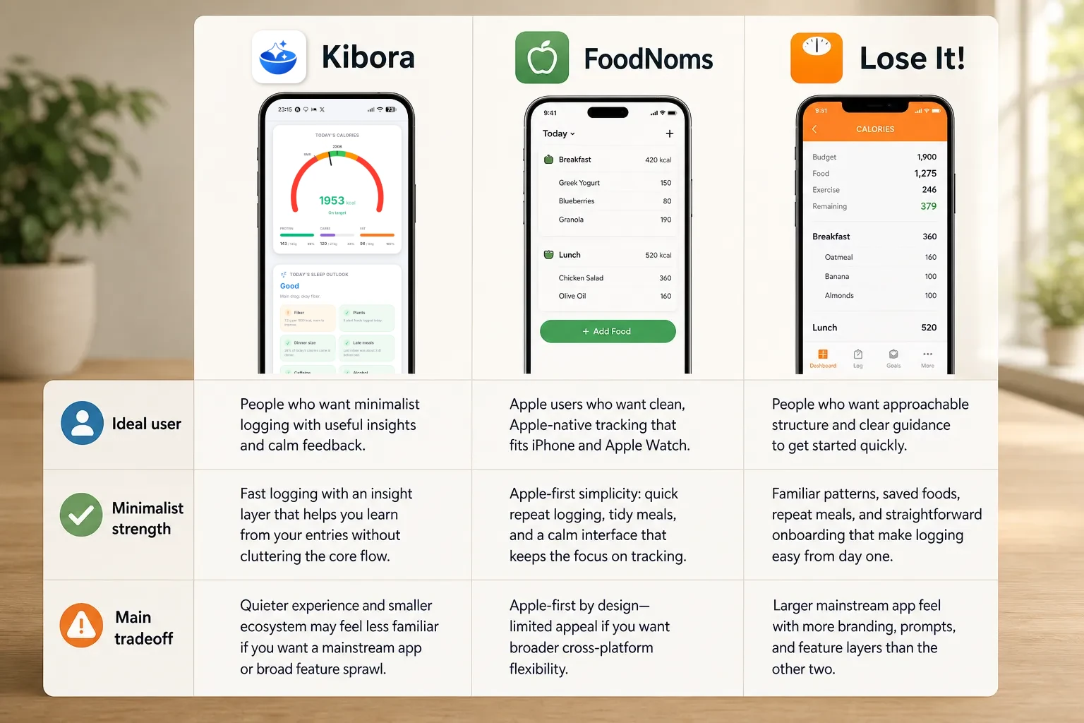
These three rank highest for the same reason: they are the best aligned with low-friction daily logging. They reduce repeated work, keep the interface calm enough to stay usable, and still give you enough feedback to notice patterns and correct mistakes instead of turning tracking into data entry for its own sake.
That is the real minimalist test. The top minimalist apps do not strip tracking down to nothing; they keep the parts that reduce repeated work and hide the parts you do not need every day.
Kibora
Best for: people who want minimalist logging without losing the insight layer. Kibora stands out because it aims to keep the day-to-day flow light while still helping you interpret what you logged, rather than acting like a bare calorie notebook.
What feels minimal: the appeal here is not just a clean screen. It is that logging is designed to stay quick, and the feedback is meant to be useful without crowding the core flow. If you want to verify exactly how Kibora handles logging and feedback, its feature pages and the supplied verification materials support that positioning.
What to check before choosing: make sure Kibora’s style of feedback matches what you want from a simple nutrition tracker. If you prefer a huge food ecosystem, a very established mainstream brand, or a more traditional calorie-first experience, its quieter approach may feel less familiar.
Choose it if: you want a fast food logging app that stays calm but still helps you learn from your entries.
Skip it if: you want the most conventional mass-market tracker experience or the broadest feature sprawl.
FoodNoms
Best for: Apple users who want clean, Apple-first tracking. FoodNoms is one of the strongest minimalist candidates because the experience is built around iPhone and the wider Apple ecosystem, which helps it feel coherent rather than bolted together, according to its official site.
What feels minimal: fast repeat logging, tidy meal entry, and a calmer interface than many mainstream trackers. Its strength is that advanced features do not immediately dominate the screen, so everyday logging stays the main task.
What to check before choosing: the Apple-first advantage is also the obvious limitation. If you are not committed to Apple devices, or you want a more platform-agnostic app, this can be a practical reason to look elsewhere.
Choose it if: you want an easy calorie tracking app that feels native to Apple hardware.
Skip it if: you need broader cross-platform flexibility or a more mainstream coaching feel.
Lose It!
Best for: people who want approachable structure. If Kibora leans toward calm interpretation and FoodNoms leans toward Apple-native simplicity, Lose It! leans toward mainstream usability with enough guidance to help new users stay oriented.
What feels minimal: familiar logging patterns, saved foods and repeat meals, and a straightforward onboarding path. It is not the sparsest app here, but its structure can actually reduce work for beginners who would feel lost in a tool that offers too little direction.
What to check before choosing: this is still a larger consumer app, so some readers will be more sensitive to branding, prompts, or feature layers that feel less quiet than the other two. Minimalism here comes from usability, not from being stripped down.
Choose it if: you want a simple calorie tracker app with enough structure to make logging feel easy from day one.
Skip it if: you are specifically trying to avoid a more mainstream app feel or want the calmest possible interface.
The conditional picks: Cronometer, FatSecret, MyFitnessPal, and YAZIO
These apps can still be great choices. They just fit users who value something specific, like nutrient depth, free access, familiarity, or guided structure, more than a perfectly calm interface. A tracker can be excellent and still not be minimalist; the real test is whether the extra detail reduces your work or becomes one more thing to manage.
Cronometer is the clearest example. Its official positioning leans hard into verified nutrition data, detailed micronutrients, and deeper analysis, which makes it especially appealing if accuracy matters more to you than speed alone.
- Minimalist strength: strong data quality, detailed nutrient breakdowns, and useful precision for people who actually act on that information.
- Friction to watch: more numbers, more settings, and more depth than a strict minimalist calorie tracker user may want every day.
If you are choosing between Cronometer and MyFitnessPal, this is often the real fork in the road: Cronometer gives you more nutritional depth, while MyFitnessPal gives you a broader mainstream ecosystem. MyFitnessPal still works well for plenty of people because its food search is familiar, its database is extensive, and many users already know the flow.
- Minimalist strength: huge familiarity, broad food search, and lots of saved foods and recipes for repeat logging.
- Friction to watch: denser dashboards, more feature surfaces, and premium prompts that can make it feel less quiet than a true easy calorie tracking app.
Recent App Store and Google Play reviews commonly mention that MyFitnessPal feels busy for some users, while Cronometer can feel a bit technical for others. That does not make either one bad. It just shows how differently people define “simple” once daily logging starts colliding with dashboards, prompts, and analysis layers.
FatSecret remains worth a look if you want a straightforward basic tracker with broad free access. Its official site still emphasizes free calorie counting, food diary tools, and community features, which is helpful for some users but not automatically calming for all.
- Minimalist strength: familiar food diary flow and a solid free option for basic logging.
- Friction to watch: community elements and an older interface style that may not feel especially calm or modern.
YAZIO sits on the other end of the spectrum. It is better for people who want coaching, plans, and meal structure, not just a quiet utility they open, log, and close.
- Minimalist strength: helpful guidance if structure is what keeps you consistent.
- Friction to watch: meal plans, coaching surfaces, and subscription-oriented features can feel like extra overhead if you only want fast food logging.
So the right pick here depends on what kind of “less work” you mean. If less work means better accuracy, Cronometer may win. If it means free basic tracking, FatSecret may fit. If it means a familiar ecosystem, MyFitnessPal still earns consideration. If it means guidance and structure, YAZIO makes more sense. If your version of minimalism also includes fewer interruptions, ads, or upgrade nudges, our guide to calorie tracker apps without ads may help narrow the field further.
The features that matter more than a clean home screen
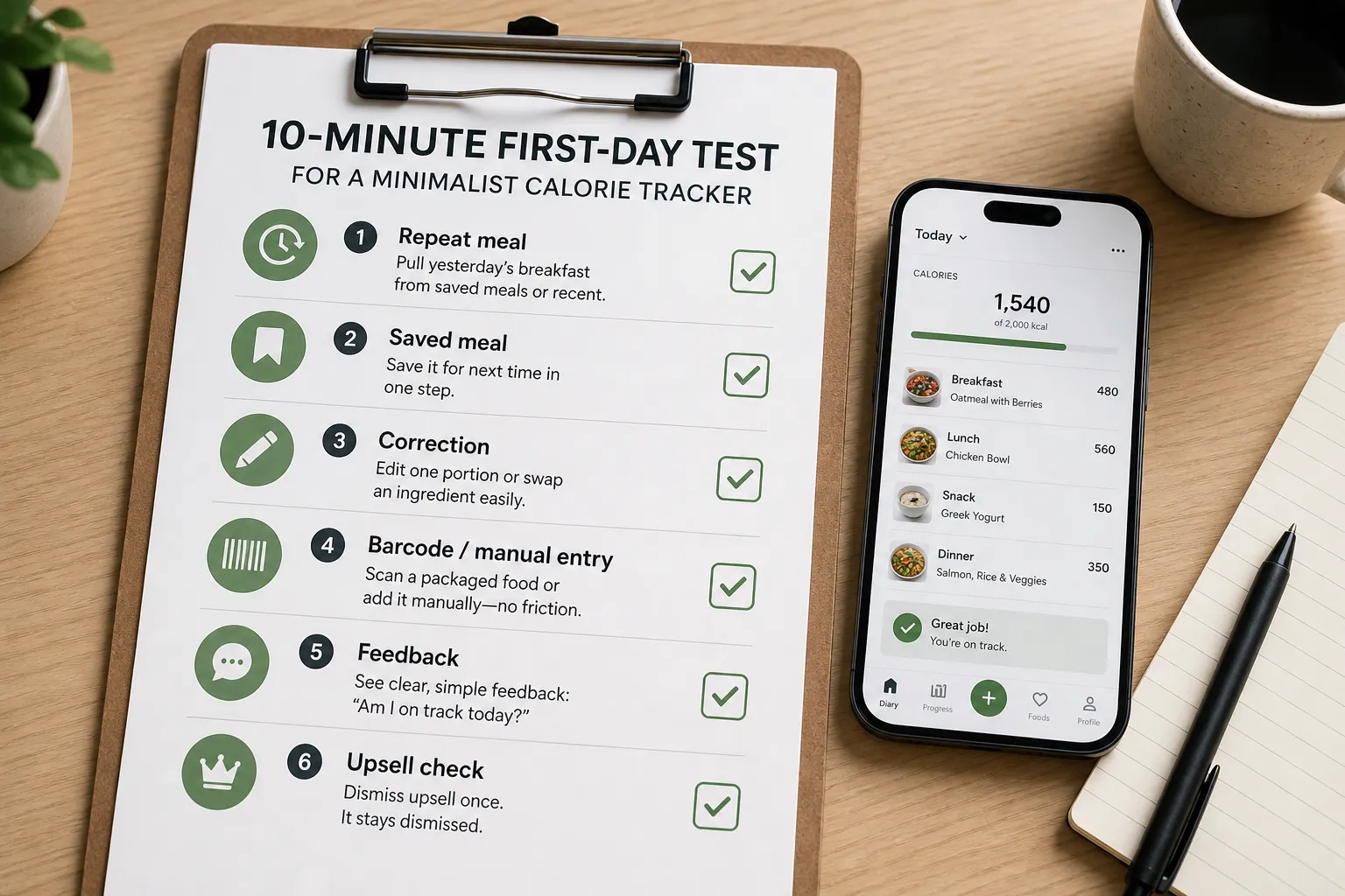
A minimalist calorie tracker should prove itself in the first 10 minutes. Try one simple test: log yesterday’s breakfast, save it, edit one portion size, add one packaged food, and then check whether the app explains the day clearly without pushing you through extra screens.
The first thing to test is repeat logging. If you eat the same breakfast often, the app should let you pull it from saved meals, favorites, or recent foods in a few taps. If an app makes you rebuild the same meal from scratch every week, it is not minimalist in the way that matters.
Next, break something on purpose. Change the toast from one slice to two, or swap whole milk for skim, and see how easy it is to correct the entry. Every database has gaps and every user makes mistakes, so manual entry and editing matter more than a polished dashboard. If you want a deeper look at keeping logging quick without getting sloppy, this guide on accurate calorie tracking is a useful companion.
Then test packaged food. Scan a cereal box or yogurt cup and ask three questions: was barcode scanning easy to find, was the result accurate, and did the app interrupt you with a paywall or upsell? User complaints on the App Store and Google Play often center on this exact friction point.
If the app offers photo logging, use it once for that same breakfast. It only helps if it reduces typing without creating a second round of confirmation, corrections, or vague estimates that you still have to fix manually.
Finally, check the feedback screen and the business model. A good simple nutrition tracker shows enough progress to answer “How am I doing today?” without drowning you in charts, and a truly calm app lets you dismiss an upsell once instead of every session. Advanced features are fine if they stay optional, which is part of why some users like Kibora’s approach to keeping insight available without making every log feel heavier.
Which minimalist tracker should you choose?
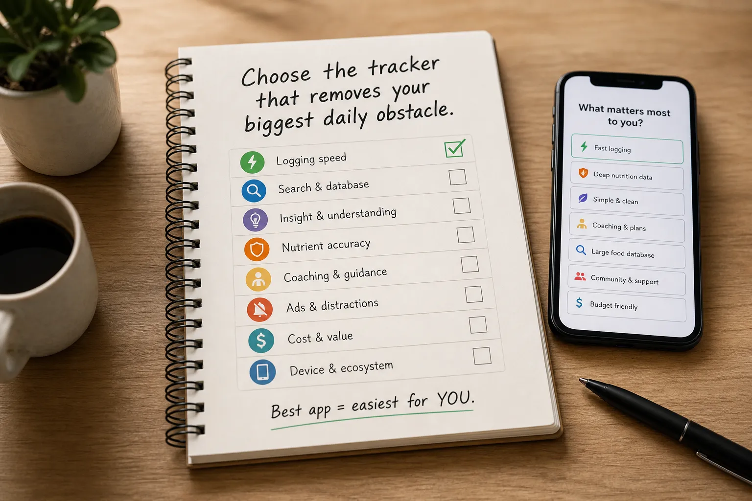
If you only remember one rule, make it this: choose the tracker that removes your biggest daily obstacle, whether that is searching, editing, interpreting, paying, or simply reopening the app tomorrow. The best minimalist calorie tracker app is the one that makes your most common logging task feel easiest.
- Choose Kibora if you want a calm, low-friction tracker that still helps you understand what your logs mean, not just collect them. It fits the reader who wants minimalist logging without losing the insight layer.
- Choose FoodNoms if you are Apple-first and care most about a polished, clean logging experience across your Apple devices.
- Choose Lose It! if you are a beginner who wants familiar structure, clear weight-loss framing, and a mainstream app that feels easy to learn.
- Choose Cronometer if accuracy matters more than strict minimalism. It is the better pick for users who care about nutrient depth, verification, and tighter data control.
- Choose FatSecret if you want a straightforward basic tracker and do not mind a more traditional interface or community elements.
- Choose MyFitnessPal if database familiarity and ecosystem matter more to you than avoiding clutter or upsell friction.
- Choose YAZIO if you want coaching, plans, and more guidance, even if that means a less quiet experience.
A few quick reader shortcuts help. Busy repeat loggers usually do best with the app that speeds up saved meals and fast re-entry. If that is your main pain point, this related guide on calorie trackers for busy people goes deeper.
Accuracy-focused users should lean Cronometer. Ad-averse users and people tired of noisy interfaces should prioritize the apps that keep feedback clear and optional, not the ones with the longest feature list.
Advanced features are not automatically anti-minimalist. They only become friction when they interrupt logging, clutter correction, or make tomorrow’s check-in feel heavier than today’s.
The best minimalist app is the one you can keep using
The winner is not the app with the emptiest interface. It is the one that makes logging feel light enough to repeat while still giving you enough feedback to notice patterns, fix mistakes, and stay aware.
That is why the best choice depends on what kind of friction bothers you most. For most people who want a fast food logging app with a calmer workflow, Kibora, FoodNoms, and Lose It! are the strongest starting points. If your priority is a specific strength like deeper accuracy, broader free access, familiar database coverage, or more structured guidance, Cronometer, FatSecret, MyFitnessPal, and YAZIO can make more sense.
A calorie tracker earns its place on your phone only if it makes awareness easier than avoidance. Advanced features are not a problem by themselves. They only stop feeling minimalist when they make everyday logging slower, noisier, or easier to skip.
Before you commit, run one simple test today:
- Log one real meal from scratch.
- Log one saved meal or repeat entry.
- Correct one mistake.
- Check one progress screen.
If an app adds more work than awareness, delete it. The best minimalist calorie tracker app is the one you will still be willing to open next week.
- Key sources
- Kibora verification doc
- Kibora verification spreadsheet
- MyFitnessPal official site
- Lose It! official site
- Cronometer official site
- FatSecret official site
- FoodNoms official site
- YAZIO official site
- App Store listings and recent reviews for candidate apps
- Google Play listings and recent reviews for candidate apps
- National Institute of Diabetes and Digestive and Kidney Diseases: Weight Management Strategies
- Peer-reviewed studies on self-monitoring for weight management